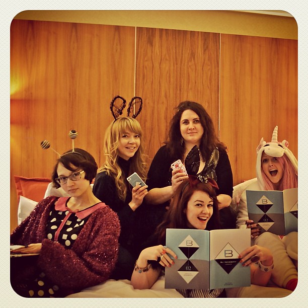
I just wrapped up a digital media kit for The Blogcademy and I’d like to shed a bit more light on media kits overall. Over the last three years, I’ve switched from traditional press kit folders to digital media kits and my clients have found huge success using them. With sharp editorial-style layouts and clickable links all in a PDF format that’s email-friendly, it’s easy to get the word out in a quick, professional manner whether you’re a blogger or a small business.


Historically, digital media kits have been most commonly used by large magazines to provide information including circulation rates and stats of their target audience for advertisers. Often, they also include a brief bio, testimonials and contact information.

After designing my first media kit for a print magazine in 2008, I had the realization that they would be ideal for bloggers too. Sometimes a one-sheet just isn’t enough information if you’re trying to land bigger gigs and advertisers. I’ve designed a lot of media kits over the last few years — my two personal favorites are for Rock N Roll Bride (this is Kat’s older version — we just wrapped a 2013 refresh that more closely matches her magazine) and Veronica Varlow (who happened to be our special guest at the New York Blogcademy!).
At The Blogcademy, we’ve had a one sheet since the beginning to send out to sponsors but realized that while that was perfect for filling goodie bags, we needed something more robust for larger corporate partnerships that may pop up. It’s important to always be prepared for those potentially huge moments! 14 pages later, we’re feeling much more prepared for what 2013 holds.
In the media kits I put together, especially for bloggers, I usually start by suggesting the following:
• Front and back covers with a visible URL and logo
• An introduction with key accomplishments
• Testimonials from readers and clients
• Stats including traffic and social media numbers
• Rates / packages / availability
• Suggestions for how to make the most out of your partnership (recommendations for achieving the best results)
• Professional images of your brand / blog / yourself throughout
• Contact page with clickable links
From this list, we add and subtract content until the balance feels right. Each media kit should be very specific to that brand. There are some crossover design elements I’ve used but for the most part, every media kit is a clean slate.

If you’re attending The Blogcademy London, we do a much more in-depth media kit overview during my branding segment. I hope this glimpse inside media kits makes them feel less mysterious!
*All photos in the media kit are by Devlin Photos and Made U Look Photography.

